By default, the latest Twentytwenty theme for WordPress has a bias towards mobile devices. It does look nice on a phone and tablet but on the desktop or laptop, the width is too narrow and makes things very unpleasant to read. The fix is easy, and just requires a custom change to the CSS.
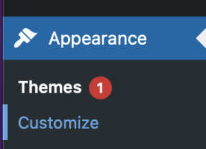
First, in the WordPress admin section, select the Appearance left menu item. Next click on customize.
Next you will see the customizer for the current theme.
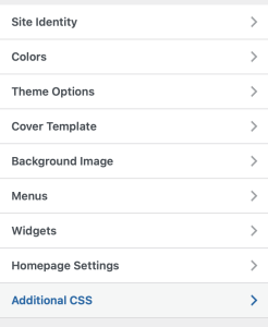
From here, select Additional CSS and add the code to the edit field.
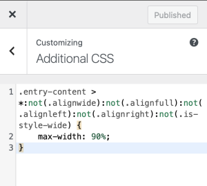
Copy and paste in this code and then save changes. Your template will now look more wide on desktops and laptops and still look good on mobile devices!
.entry-content > *:not(.alignwide):not(.alignfull):not(.alignleft):not(.alignright):not(.is-style-wide) {
    max-width: 90%;
}